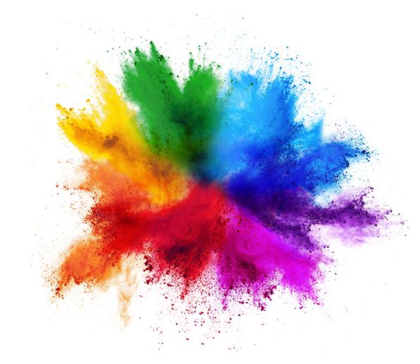
Using color advertising is a great way to attract — or repel — an audience. Since we’re all in this to be successful, let’s concentrate on ways to appeal to potential customers.
Anyone can just slap a color on a printed or online ad and be done with it. The simplest and sometimes most effective way is to just go with your logo color(s). Quick and easy, right? Yes and yes, but it’s important to think about the visual message you’re trying to convey. Choosing the right color can be as important as the words you use.
Keep all this in mind when picking a shade for your color ads.
Blue
One of the safest and most popular colors in the palette. Blue has a calming effect; it promotes stability. It conveys responsibility and all of its shades are useful (light blue for baby boy advertising, darker blue for Ford).
The downside is that it doesn’t create a sense of urgency. It’s just too stable. That brings us to…
Red
Fire trucks. Ambulances. Motorcycle dealerships. Dating websites. All use red to catch the viewer’s eye. It’s a hot, vibrant color that can’t be missed. Red means stop and pay attention…now! It’s passionate and bold.
But there’s little subtlety here, unlike our next color.
Green
It’s calm, mature and professional. Looking for a little good luck? Go with green. Concerned about the environment? Green is your color. Investment firms and financial advisors love it, of course.
It can sometimes be a little too low-key. Maybe you need a touch of…
Orange
Red’s toned-down cousin is great for fun advertising (Minute Maid drinks) or when the summer transitions into fall. It promotes vitality and energy.
Orange doesn’t, however, promote luxury. That’s a strength of our next shade.
Purple
The long-standing color of royalty still holds a strong place in the advertising canon. The Los Angeles Lakers, winners of 16 NBA titles counting their time in Minneapolis, chose it as one of their primary colors. It’s a bit mysterious; how rarely do you see it in nature?
Purple is many things, but down to earth isn’t one. For that, turn to…
Brown
OK, not the most exciting color in the crayon box. That had no impact on UPS when it chose brown as its primary shade. UPS wanted to convey a message of reliability and brown has worked for many years. We all remember the “What has brown done for you?” ad campaign.
Maybe the burnt sienna Crayola didn’t get you too fired up. No one says that about…
Yellow
Yellow can be a mixed bag. Youthful but dangerous. Warm but sometimes too hot. Movie posters use the color to great effect. Check out “The Shining.”
Sometimes all you really need is…
Black or white
Boring? Only if you don’t know how to do it right. Black means luxury, power and formality. It’s fantastic for a pricey fund-raising event (when black tie isn’t merely optional).
White is all about cleanliness, simplicity and innocence. Why do you think the white dove embodies the peace movement?
West Press’ talented staff is here to help you each step of the way — from graphic design to printing to mailing services to large format to website development. Contact West Press or your Account Executive at 520-624-4939 today.

