
If the primary goal of a banner is to grab the viewer’s attention and communicate a message, the banner should be readable and visually attractive. Here are some tips to maximize a banner’s effectiveness:
Start with our banner blogs
We have two helpful blogs that cover large format graphics and signage:
• Tips for Creating Effective Large Format Signage
• How To Make a Sizable Impact Using Large Format
Fonts
Avoid using more than two fonts. Sans serif styles like Helvetica and Futura are easier to read from a distance. Stay away from using all upper case lettering throughout your banner. You can use it for one word or a line of text for emphasis, but realize it takes longer to process words in upper case.
Graphics
Use logos and photos to catch the viewer’s attention but not overpower the banner’s main message. Make sure to use a high-resolution image so that it is as crisp and clear as possible.
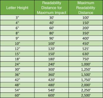
Viewing distance and time
If someone is passing your banner in a car, the passengers will only have about 1.5 to 3 seconds to read a message while in motion. Here’s a helpful chart to determine the correct letter height based on the readability distance:
Contact your West Press Account Executive at 520-624-4939 to talk about how a banner can create the next big impression for your business.